Making the ultimate weather watch
Back in 2021 I bought a Fitbit Versa, which after years of simple fitness trackers was my first "real" smart watch. At the time I was really in to running, and so the most important things I needed to know at a glance were the time, sunrise and sunset, and the next few hours of weather. If you know these things, you know when you can go for a run without getting lost or soaked. I was excited about the prospect of a watch face which could give me those things.
Unfortunately it became clear immediately that no such watch face existed in the Fitbit ecosystem, so I figured how hard can it be? Time to get hacking. I started with some concepts and very quickly homed in on a circular design I liked:
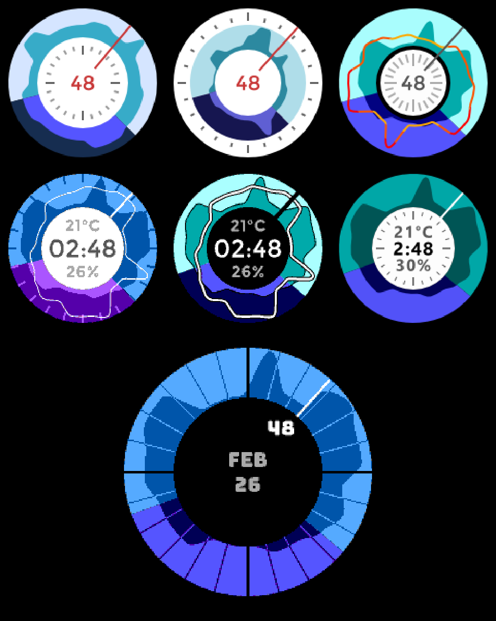
Over the next few months I iterated on this design, gradually making it more readable:
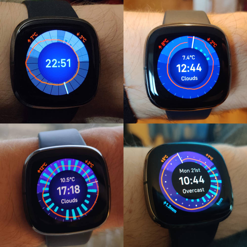
How to read the watch face
The watch face is a graph showing weather for the next 24 hours. The top of the circular graph is noon, the bottom is midnight, and the white line is the current time. To read the graph, start at the white line and read clockwise to see how the weather will progress over the next 24 hours.
There are three main bits of information presented on this graph:
- The orange line represents the temperature, with the lowest temperature at the innermost point and the highest at the outermost point. Minimum and maximum temperatures over the next 24 hours are shown in the top left and right corners.
- The cyan bars represent precipitation (which includes both rain and snow.) The width of the bar shows the probability of rain, and the height shows the expected volume. This way the area of the bar is a rough indicator of how how rainy it's going to be. The maximum hourly volume is shown in the bottom left corner, and the total volume over the next 24 hours is shown in the bottom right.
- Finally, the background colour of the graph represents daylight hours, with the lighter colour representing day, and the darker colour representing night.
You might also have noticed there's a third, "lightest" background colour. This is an optional feature and represents working hours, although I was never quite satisfied with it because it ends up obscuring the sunrise and sunset at certain times of year.
The death of Fitbit
Something I haven't mentioned is that Google bought Fitbit very shortly after I bought my Versa. Although this watch face works very nicely on that device, when the Versa 2 was announced it no longer supported custom watch faces. This is likely an indicator that Google no longer intend to support the SDK - everything should be ported over to WearOS, Google's own smart watch operating system.
The Fitbit SDK had a lot of issues which meant the weather data never loaded reliably, so I never felt it was polished enough for a public release. I'd like to focus on building something polished enough to actually launch this time. Time to learn Kotlin!